Posts tagged with "Colors"

“FLOWERS” by TOBi via 360 MAGAZINE

TOBi – “FLOWERS”

TOBi DROPS NEW SINGLE AND VISUALIZER “FLOWERS”

FROM FORTHCOMING ALBUM COMING SOON 

LISTEN/WATCH HERE

Nigerian born, Toronto-based artist TOBi drops his brand new single and visualizer “Flowers” via Same Plate Entertainment/RCA Records – click here to listen/watch. The guitar-driven track allows TOBi’s undeniable bars and effortless flow to lead the way for this genre-blending song. This release is the first single off of TOBi’s forthcoming album coming soon. Recently, TOBi released his elevated COLORS performance of “Flowers” and his song “Move” was featured on Netflix’s buzzing new movie release Do Revenge starring Camila Mendes (Riverdale) and Maya Hawke (Stranger Things).

Listen to “Flowers” HERE

TOBi on “Flowers” and his forthcoming album: “This is one of my favorite songs I’ve done. The definition of unapologetic soul music. I wanted to tell a story of what it meant to be a man, growing and learning and dealing with my vices. Protecting my peace, while navigating the challenges of life. This song is a turning point in my mental journey. Addressing fears, seeking therapy, paying homage to those who are living.. its a lot to unpack in the verses but at the end of the day it feels so good to be alive and creating and I’m grateful for every moment.”

Recently, TOBi released his Alex Goose-produced single and video Before We Panic” featuring Mikky Ekko(written for Rihanna, A$AP Rocky, Drake), which was a prelude to his forthcoming album. The artistic visual was shot and directed by Dom McLennon (BROCKHAMPTON) and Jeremy Grier.

Stay tuned for more music from TOBi coming soon.

About TOBi:

Nigerian-born, Toronto-based recording artist TOBi is the winner of the 2021 JUNO Award for “Best Rap Recording of the Year” for his latest project Elements, Vol. 1Elements blends hip-hop, R&B, soul, grime & Afrobeats and features some of TOBi’s favorite producers and musicians worldwide, embodying the sounds and music that have influenced his artistry. Prior to this album, TOBi released his debut STILL in May 2019, exploring themes of vulnerability, post traumatic growth, self-reflection and masculinity in his time emigrating from Nigeria to Canada.

Voted by Complex Magazine as “a top artist to watch” TOBi has received critical praise from Interview MagazinePitchfork, Vogue, Teen Vogue, L’OfficielPaper, Billboard, Rolling Stone, Clash, OkayAfrica, Flaunt, Exclaim!, Refinery29, Essential Homme, COLORS, and many more.

In 2020, TOBi signed with Same Plate Entertainment/RCA Records and in 2021 his single “Whoa” with fellow Torontonian rapper Jazz Cartier was released to critical praise. “Whoa” follows a slew of tracks released over the summer including “Off The Drugs” with Mick Jenkins, “Come As You Are” featuring Baby Rose and “Don’t Touch!,” which was praised by Complex for its “smooth production…elevating [TOBi’s] empowered musings on the hairy side of the Black experience to new heights.” TOBi, who was nominated for the 2022 JUNO Awards, has continually released music including his Shall I Continue? bundle, Too Hot (Maxi Single) bundle and single “That’s Alright” this past year. Most recently, TOBi dropped the single and video for “Before We Panic” – a prelude that set the tone for his new music. Now ready to share that music with his fans, TOBi shares “Flowers,” the first single off his forthcoming album coming soon.

“FLOWERS” by TOBi via 360 MAGAZINE

Buy/Stream/Watch “Flowers”:

Multi: https://tobi.lnk.to/Flowers

Buy/Stream/Watch “Before We Panic”:

Multi: https://tobi.lnk.to/beforewepanic

YouTube: https://www.youtube.com/watch?v=X7aCfKxmYMs

Keep Up with TOBi:

Instagram –  Twitter – Facebook – YouTube

illustration by Alex Bogdan for use by 360 magazine

Three Inexpensive Ways to Create a Modern Looking Home

We all want to have a home that is cozy and modern. The only thing that may keep us from pursuing our modernization project would be the thought of how much it would cost. After all, the beautiful homes and interior designs we see in magazines or our friends’ homes look expensive and, therefore, elusive. However, creating a modern-looking home does not need to cost an arm and a leg, as you may imagine. With your creativity and resourcefulness, you can have a place that looks exactly how you dreamed it would be. For instance, you can always find cheap fabric to make beautiful curtains and other DIY home decor projects that can enhance the look of your home.
Read on below to learn a few valuable tips on how to create a modern-looking home inexpensively.
Wallpaper or repaint
Two of the best ways to modernize your home are to refresh its walls with a new coat of paint or wallpaper. Nonetheless, it is essential to pay attention to the colors you decide to use. It is best to repaint with lighter shades such as creams and pastels if you have smaller spaces. These colors will make the rooms look more expensive. Darker shades will only make small areas look even smaller. Regarding the wallpaper, it would be a better option to keep away from patterns that are too bright or have too many prints going on. Should you decide on this, you may want to confine it to one wall as a contrast. Busy patterns can also make a room appear cramped. You may also want to pay attention to your doors, repainting them in a complementing shade to give them a fresh appearance.
Neaten the place
It is no secret that decluttering can instantly transform any home into an attractive and cozy place. If you have too many things occupying most of your space, your home will only look cluttered and uncomfortable to live in. Most modern homes are minimalistic, making them more spacious and airier. Keep your surfaces clear of unnecessary items and avoid overdoing the decor. Have a place for everything and keep everything in its proper place. Lastly, avoid overcrowding with furniture that you don’t need. You want to have space to move around, so it would be best to keep your floors clear.
Add a touch of nature
Plants and flowers beautify any room you put them in. Their colors add life and make a home look pleasant and welcoming. More than that, plants are excellent air purifiers that help remove toxins from your indoor air. They can be included in any home’s room to enhance their look further and keep the air clean.
Your home is a reflection of your personality. The home environment can also affect your mood. Thus, it would be an excellent idea to do what you can to make it as attractive and comfortable as possible. Then, you can start your remodeling project without worrying about spending too much. These tips will help you achieve what you set out to do on a budget.

Hotel illustration from Alejandra Villagraat 360 Magazine for use by 360 Magazine

Rose Hotel Offers New Package

Tis the season to be merry and bright! The Rose Hotel Chicago O’Hare, a Tapestry Collection by Hilton and closest hotel to Chicago O’Hare International Airport located at 5200 Pearl Street, is inviting families of all ages to get in the holiday spirit by offering an exclusive Amaze Light Festival Package, which includes a trip to Impact Field to enjoy the limited time installment of The Amaze Light Show, one of the largest holiday lighting events in the country, located across the street from the hotel. The package includes two adult and two child tickets to the light show, along with two light-up holiday toys to commemorate the light fun back in the room or at home, along with breakfast for two adults and two children, and overnight parking for one vehicle. The package is available now beginning at $185.  

“The Amaze Light Festival Package is the perfect way to kick off this holiday season,” said Micaela Haas, General Manager of The Rose Hotel Chicago O’Hare, Tapestry Collection by Hilton. “This may be the first time many are seeing their relatives since the beginning of the pandemic or taking a little trip away from home, so we are ecstatic to help shape new, wonderful memories that will help make these holidays a little more bright.” 

An energetic and edgy boutique hotel, The Rose Hotel features 165 stylish guest rooms and suites, all curated through the contributions of DLR, Getty’s Group, and Janko Group. Visually stimulating art, thoughtfully woven throughout the design of each room, creates an elegant and innovative ambiance, perfect for all families to enjoy. Each guest room is equipped with all down alternative bedding, triple-pane windows to eliminate airplane noise and a pillow menu, offering a personalized sleep experience. Single rooms include a king size bed, and each double room comes complete with two queen size beds. To keep all guests feeling comfortable travelling again, The Rose Hotel, in partnership with RB, maker of Lysol & Dettol, have developed and implemented Hilton CleanStay, a program committed to enhance training for Team Members, increase cleaning of public areas, fully flexible booking options, modified services and amenities, face mask requirements in all indoor public areas of the hotel, and much more to keep each guests’ safety and peace of mind at the utmost importance. 

The Amaze Light Festival Package is available now to book for the upcoming holiday season. For more information or to book this special offering, please visit the hotel’s website.

About The Rose Hotel Chicago/O’Hare, Tapestry Collection by Hilton 

Owned by Janko Group and managed by Janko Hospitality, The Rose Hotel is centrally located at 5200 Pearl St. Situated in Rosemont’s recently developed Pearl District and adjacent to Chicago’s O’Hare International Airport, The Rose offers an upscale experience by providing a fine art inspired lobby design, highly personalized service, the finest amenities, and a quintessential destination for those shopping at the Fashion Outlets of Chicago, located just moments away. The property holds 165 guest rooms and suites, 6,000 square feet of flexible meeting and event space, their signature restaurant and bar Thorn Restaurant & Lounge, and a state-of-the-art fitness center. . For more information, visit www.the-rose-hotel.com.

Art illustration by Symara Wilson for use by 360 MAGAZINE

Four Tips for Putting Together an Outfit

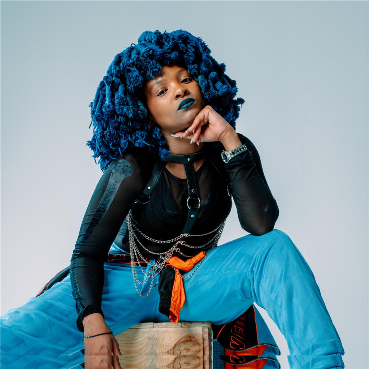
Anyone can throw on some clothing; but putting together an outfit is an entirely different story. A few items may look great separately and then look horrible once you wear them at the same time. Similarly, some items may look boring and plain yet come together to create an amazing outfit.

Some people have a natural eye for fashion and can throw together a runway-ready outfit within minutes, but others may need some tips. If you want to branch out and try new styles, or simply want to learn what goes into a great outfit, then this post is for you.

Determine the occasion

An outfit can only live up to its full potential if it’s in the right environment. For example, an elegant suit may look stunning, but it won’t look stunning at a child’s birthday party – it will simply look out of place.

Similarly, a casual outfit of jeans and a t-shirt can be an outfit on its own, but not for a formal event. Determining the event will give you a starting point for your outfit. For example, if you are going to homecoming, you will need to look at homecoming dresses to find the base of your outfit.

Choose your colors

There are a few things to consider when it comes to the colors of your outfit. The first is your skin tone. Some colors may look better than others because of your skin’s undertone. Click here to learn more about your undertones.

Secondly, which colors do you want to use together? Are you going for a monochromatic look? Maybe a pastel look? Or perhaps a neutral color scheme? There are so many options. If you don’t know where to begin, think about the occasion again. Muted and understated colors are better for professional events than bright and bold colors.

Choose your patterns

Patterns can make or break an outfit. Some people prefer to use only solid colors, which is fine, but we would recommend still adding some pattern to your outfit by incorporating a scarf or something similar. Recently, mixing patterns has become quite the trend. Sometimes, it results in beautiful, unique outfits. Other times, it could be a bit of a disaster. So, if you’re new to fashion, you may want to stick with a few solid-colored items of clothing, and then one patterned item. However, if you are brave, you can try mixing patterns and prints.

Accessorize

Many people think that clothing is what makes an outfit. And yes, it’s true – clothing does play a huge role in an outfit. But what truly brings it together will be your accessories.

Accessories usually take the form of belts, bags, and jewelry, but makeup and hairstyles can also serve as accessories. If you have a plain outfit, pair it with bold accessories to spice it up. And, of course, if you are wearing a very intense and busy outfit, use classic and basic accessories so that it’s not overwhelming. A black pearl necklace might just be the final touch that your outfit needs.

art illustration by Gabrielle Marchan for use by 360 magazine

Seven Powerful Graphic Design Tips

Being a graphic designer is so much more than what meets the eye. It’s about visual communication; it uses typography, images, textures, colors to transmit specific messages to social groups, with specific objectives.

Although every designer is not just a portrait hanging on the wall, is a specialist who has their own style and specialties, there are some principles of design and basic concepts that seem to span across all areas of design.

Accordingly, I asked graphic designers what design principles they follow and what they would share with their peers-designers.

By gathering a variety of different opinions and fundamentals of graphic design, I rounded up ten essential design tips that can help you create a better-looking design in no time.

What things can you do to help refine your skills and prepare for a career in graphic design? Keep reading for insights from professional graphic designers. 

1. Explore different learning methods

There are tons of resources out there for learning the fundamentals of graphic design – beyond books and traditional academic routes. You can learn so much from practicing on your own and checking out case studies from other designers.

Here are a few great resources:

  • Behance –Behance is one of the best sources of inspiration. But you can also learn a lot from the community by sharing and receiving feedback from other designers.
  • Skillshare – Watching tutorials is a smart addition to your learning process. Just remember it’s not all about learning color theories, or font hierarchy — tutorials on how to train your mind to think like a graphic designer and understanding customer’s wants and needs are also key.
  • Networking – Networking is a fantastic way to communicate with people with a common profession and special interest and with potential clients — this is equally important as the work you produce.

2. Look for inspiration outside of your niche

When making up a logo, it makes sense to look at other logos for inspiration, right? It does. But it also makes sense to look for inspiration elsewhere.

For instance, you might look to fashion for texture inspiration or paintings for color palette ideas. Look at the shape of furniture or the way various textures interact with one another for ideas on how to combine elements together effectively.

Looking for inspiration outside of your niche allows you to understand the core principles of what makes a design “good” without the boring conceptions you have about how a design should look.

3. The typography is a king

Typography has a profound impact on the way individuals perceive a product. The right typography creates an enjoyable experience, while a type that’s hard to read or doesn’t match the message of the product can negatively impact. That’s why it’s absolutely worth spending the time and effort to find just the right typographic fit.

If you want to learn how to choose the right fonts for your product, 3 most important considerations:

  1. Don’t overdo the number of fonts
  2. Use contrasting fonts to stand out
  3. Give each letter its personal space

Keep in mind that choosing the right typography for your product projects takes experimentation — expect to try different options until you find the perfect option. That said, the investment’s completely worth it: don’t underestimate the impact that thoughtfully selected type will make on your work.

4. Colors are powerful – especially in graphic design

When it comes to designs, selecting a stunning color palette is no easy feat—and it’s certainly one that any designer or illustrator could spend hours achieving excellence.

Here’s a brief rundown of insights and tricks:

  • Start with a limited color palette. When you’re just starting out, stick to 3 to 4 colors. With a limited color palette, you can see whether the colors work well or make your eyes bleed. Then explore more complex combinations as you go along.
  • Use contrasting colors. When your colors don’t have the right amount of contrast, your customers will not know where or how to look at your illustration. Worse, your audiences’ eyeballs could get strained, especially if your chosen colors all fight for attention. To check if your illustration has the right amount of contrast, add a black-and-white adjustment layer on your illustration. That helps you adjust the brightness and darkness, play around with the colors and see what works.

5. Understand color psychology

This is a well-known fact: color impacts a user’s perception and interaction with your design. Believe it or not, the right color can keep the customers returning, while the wrong one can scare the audience away.

These are the commonly accepted meanings in most of the Western countries for the most common colors (or hues):

  • Red: love, passion, anger, courage
  • Orange: joy, warmth, sunshine, creativity
  • Yellow: happiness, enlightenment, spring
  • Green: freshness, growth, wealth, balance, health, youthfulness.
  • Blue: freedom, imagination, inspiration
  • Purple: spirituality, the subconscious, dignity
  • Black: power, elegance, sophistication
  • White: purity and innocence

It’s worth mentioning that different cultures interpret color meaning differently.

6. Hierarchy

Visual hierarchy is a vital component of good design. If everything on your page looks like it has the same importance, that’s not a good sign. You need to use visual cues to tell people what to pay attention to first, second, third, etc.

Create visual hierarchy through things like size, perspective (that creates an illusion of depth), or color. Typographic hierarchy can be created by using different typefaces, sizes, and font weights.

The point is to give visual importance to some elements over others.

7. Practice, practice, practice

So what is one biggest piece of design advice for newcomers and veteran creatives alike?

No matter the size or scale of the project, or the trajectory of your career: “You’ve got to do the work.”

Practice makes perfect! Take time every week to create designs exceptionally for the practice. Pick a type of design, a brand, or a concept you want to scrutinize, and then make a design or two.

Consider redoing existing designs to see what you might do differently or enhance. This can be an excellent exercise in figuring out why designs work the way they do and exploring your own creativity.

Looking For Some Stunning Mockups?

Looking for some high-quality mockups to make your designs shine? We’ve got you covered.

Head on over to the site for a complete collection of beautiful mockups – for more details check ls.graphics, to find mockups – made for designers, by designers.

Whether it be for a client presentation or to enhance your design portfolio, use these mockups to present your designs in the best possible light.

Wrapping Up

Like everything else, skills take time to hone and sharpen. Trust your gut, go down a rabbit hole of researching things you like, use those things for your design content, and follow these 7 graphic design tips.

Moonchild Sanelly via PIAS America for use by 360 Magazine

Moonchild Sanelly – Undumpable

Moonchild Sanelly shares her new addictive single “Undumpable, out today via Transgressive Records / [PIAS]. The track, produced by her label mate Debruit (KOKOKO!), follows the release of her highly acclaimed single “Yebo Teacher,” which garnered international praise for her refreshing and unapologetic take on female desire and sexuality.

On “Undumpable,” Moonchildmusi Sanelly muses on relationships and self-assuredness. An infectious beat accompanies Sanelly’s confident and plucky lyrics while playful vocals bring it all together. “Undumpable” is a jam through and through, destined to get you out of your seat and dancing.

On the track, Moonchild Sanelly shares: “Undumpable is a jam about a relationship where the couples’ tempers are frayed in lockdown, in a super intense atmosphere. They’re fighting but they each feel like they’ve invested too much to be easily dumped.” Sanelly, who has earned a reputation for female empowerment, defiantly sings, “You’re not gonna dump me/ I won’t let you dump me / Oh bitch / You’re gonna fix this”.

About Moonchild Sanelly

Moonchild Sanelly is South Africa’s “Queen of Gqom,” a superstar with a flow so unique it’s earned her recent collaborations with Beyonce, Ghetts, Die Antwood, Gorillaz, Diplo, and Wizkid.

Her iconic personal style combined with her outspoken approach to female sexual desire has earned her collaborations with the aforementioned Beyonce and Gorillaz as well as the likes of Diplo and Wizkid and built her a devoted fanbase. She is “a global superstar waiting to happen,” according to Damon Albarn.

With her recent releases, we see Moonchild Sanelly embark on a new and exciting chapter with a global spotlight on her. Praised for her electrifying music and unique style, she’s seen international praise everywhere from the Evening Standard, The Guardian, and Conde Nast, to The Observer, DIY, Complex, COLORS, and more.

Fearless, inclusive, and a whole lot of fun, Sanelly is just getting started.

YOUNG FRANCO Photo Credit: Casey Garnsey from Ernest Dukes, Capitol Music Group for use by 360 Magazine

AUSTRALIAN COOL KID YOUNG FRANCO CREATIVE VISUAL – COME THRU

Following the release of his breakout single “Fallin’ Apart” featuring Denzel Curry Pell, Young Franco returns with a visual for his highly addictive single “Come Thru” featuring SonReal & Jalmar. As a track, ‘Come Thru’ deals in the provision of positive energy and trusting your inner confidence. Combining a glitchy synth line with laid back drums and a sexy slick bass line creates a melting pot of formidable two step and raucous energy. Watch here.

Directed by Filipino-Canadian director Khrysta Lloren (also known as NOFAC3), “Come Thru” focuses on surrealist experimentation and queer expression through multimedia art. Inspired by The Nightmare Before Christmas and Radiohead’s music video for “Burn The Witch,” “Come Thru” transforms Young Franco, SonReal & Jalmar into claymation avatars in a hyper-visual world that’s not quite what it seems.

“When I was conceptualizing for Come Thru, I knew I wanted to create an absurdist fiction through the eyes of Young Franco’s clay character. From sculpting each character’s detail to decorating the set, working behind the scenes was just as surreal as the music video,” says video director Khyrsta Lloren. “Everything was scaled down to the size of my hands and you can actually see fingerprints on clay which is a reminder that it’s all handmade. Working with Young Franco and the team was so comforting during the late stages of this pandemic which kept our creative juices flowing.”

A joint effort from start to finish, the trio combine their respective sonic universes, whether established or blossoming, to meet comfortably in the middle. The Canadian raised, LA based rapper SonReal has accumulated over 165 million Global streams and 125 million video views. He has been nominated for multiple Juno Awards throughout his career and one of Son’s previous releases ‘Can I Get A Witness’ has gone on to be certified Double-Platinum in Canada. “Come Thru” is a very handy head start for the Melbourne based / Chilean born and ready to explode rapper, Jalmar, with Young Franco introducing the talent to a global platform. With more original music teased for 2021, the future is looking bright for Jalmar.

Young Franco’s project is currently sitting perched above the clouds, with career highlights being ticked off with every subsequent release. His most recent single, “Fallin Apart” featuring Denzel Curry and Pell took the already glowing artist to angelic levels, which was featured in an Emmy Nominated commercial for Apple Airpods. The single received a full add on Triple J, as well as radio spins globally, and featured on publications such as Clah Magazine, NME, Out Now Magazine, Colors, Sniffers, Happy Mag, Acclaim, Purple Sneakers, Pilerats and more. The track also featured as the soundtrack for Apple’s Airpod ‘Jump’ campaign which has garnered over 10 million views on YouTube and premiered during the Grammys broadcast.

TOBi Off The Drugs album cover fro Sarah Weinstein Dennison, RCA Records for use by 360 Magazine

TOBi × Mick Jenkins – Off The Drugs

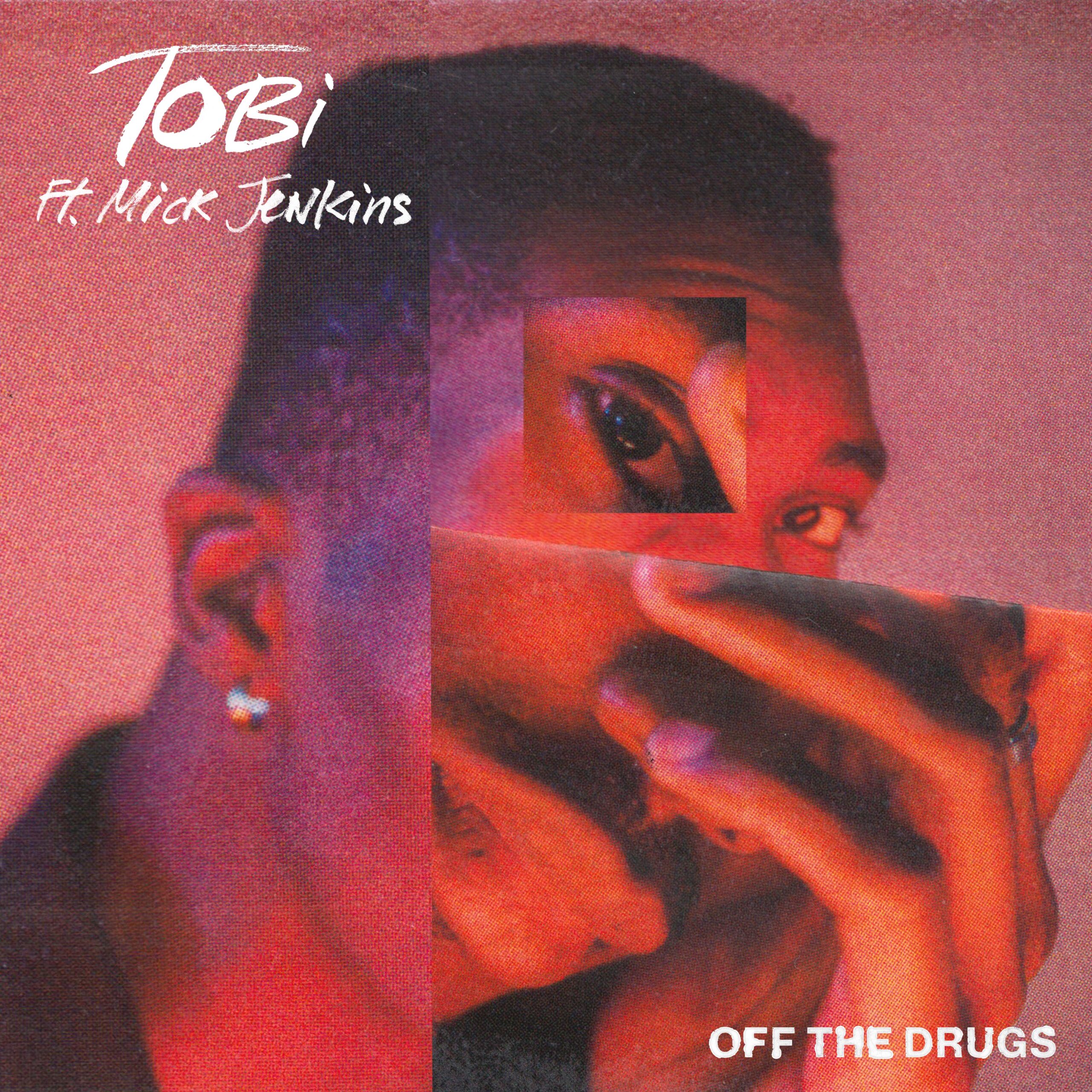
Winner of the 2021 Juno Award for Best Rap Recording of the Year for his project Elements, Vol. 1, Canada-raised/Nigeria-born TOBi and Mick Jenkins today release an old school groove “Off The Drugs” via Same Plate/RCA Records.

Listen/watch the lyric video here.

Speaking on the inspiration behind the song, TOBi says, “When I smoke, I see things clearer and I’m way more aware. So I’m intentional about how I use it. I think more money should go into researching things like cannabis and mushrooms for their healing properties. Just the way I look at it, so many things are actually drugs—alcohol, gambling, even social media cuz it affects brain chemistry, but all that shit is legal. Whereas things that can legitimately heal if properly understood and done correctly are stigmatized, it’s wild. Mick came thru and bodied the verse as he should, and we’ve got a video on the way too. I just wanna live life to the fullest and enjoy this while it lasts. Life to me is a good trip if you let it be.”

The slow burning track follows a handful of TOBi’s singles  “Come As You Are” featuring Baby Rose and “Don’t Touch!” which Complex heralded for its “smooth production…elevating (TOBi’s) empowered musings on the hairy side of the Black experience to new heights.”

His re-working of track “Family Matters” with Flo Milli was described as a “dynamic” and “impassioned reboot” (Atwood) and Highsnobiety declared it a “formidable pairing.”

ABOUT TOBi

TOBi released his music project ELEMENTS, Vol. 1 in fall 2020, heralded by the critics, combining hip-hop, R&B, soul, grime & Afrobeats. The project features some of TOBi’s favorite producers & musicians worldwide and embodies the sounds and music that have influenced his artistry. TOBi was voted by Complex Magazine as “a top artist to watch” and has received critical praise from Interview MagazinePitchfork, Vogue, Teen Vogue, L’Officiel, Paper, Billboard, Rolling Stone, Clash, OkayAfrica, Flaunt, Exclaim!, Refinery29, Essential Homme, COLORS, and many more. The rising star announced his partnership with Same Plate Entertainment/RCA Records last year and has enjoyed over 49 million streams globally. Prior to ELEMENTS, TOBi released his debut album STILL in May 2019 followed by a deluxe edition, exploring themes of vulnerability, post traumatic growth, self-reflection and masculinity in his time emigrating from Nigeria to Canada. STILL’s release was followed by two new singles “Holiday” produced by !llmind, “Paid,” the “City Blues Remix” featuring The Game, the “180 Remix” featuring Kemba and the “24” remix featuring all Torontonians SHAD, Haviah Mighty, Jazz Cartier and Ejji Smith.

TOBi has cited the work of Gil Scott-Heron, Frank Ocean, Kendrick Lamar, Marvin Gaye, Eartha Kitt, Florence and the Machine, and Andre 3000 as some of the artists who have inspired his work, particularly his lyrics.

Follow TOBi:

Instagram – Facebook – Twitter – YouTube – Spotify – Apple


By Mina Tocalini for 360 MAGAZINE

Vintage Colors – Outfit Your Website in Modern Retro

The phrase ‘modern retro’ might sound like an oxymoron but it’s just an easy way of describing something that has crept its way back into fashion, even if it died in ignominy many decades ago. It’s the kind of trend that causes coffee shops to blend pop art with vintage furnishings or hospital green appliances with white subway tiles. It’s a collision, in other words, often of two or more disparate design decades.

While it’s easy to expect this kind of trend to crop up in interior design circles, websites began experimenting with modern retro around the same time that millennials started to forget about the days they spent living in the 80s and 90s; that is, about five years ago. The difficulty inherent in this style of work is melding classic colors and imagery without compromising the usability of the website.

70s, 80s, and 90s

But what did these decades look like? The 90s were bright, chaotic, and kitschy, encapsulated by the ‘jazz’ cup design created by Gina Ekiss. The previous decade, the 80s, was more about neons, burnished metals, and pinks and blues. Lastly, the 70s liked its oranges and browns and large repeating patterns. Oddly enough, our experiments with decade-spanning trends seemed to end around the turn of the millennium.

However, one of the design fascinations that never seems to go away involves space, futurism, and technology. For instance, the website of AI-based energy company Nesh has domed habitats flanking its namesake smart assistant, while Genesis Casino features astronauts, planets, and satellites. The latter is one of the more technology-forward sites too; it’s a paysafecard online casino and accepts Apple Pay. This shows the broad adoption of this style.

Contributors to website awards site Awwwards point to the Soviet Design page as a good example of 90s stylings. One of the best places to look for website inspiration with 80s leanings, though, is not a website at all. Artistic movements like vaporwave and future funk have the Blade Runner decade pinned down to its most basic elements. Large and loud typefaces are the key to creating a site with a convincing 70s vibe.

Simplicity

An important point to remember is that the further back in time you plan to go, the less complicated your design needs to be. Marketing materials made in the 70s, for instance, are unlikely to have been in a digital format, which restricts their complexity to whatever a printing press could handle at the time. The reverse, an overabundance of options, is perhaps why the 90s were so chaotic.

Ironically, one of the few design schemes to hit the mainstream in the 2010s was simple almost to a fault. Flat design, which was arguably pioneered by Microsoft in its Windows 8 operating system, stripped the outlines and details away and replaced them with ‘flat’ colors. This style often makes use of long shadows and has been central to the design philosophy of Google and Apple too.

Modern retro allows companies to leverage nostalgia and a love for all things vintage to capture customers’ collective hearts.

PUMA Clyde All-Pro

PUMA announced the newest addition to the Clyde Franchise Monday with its brand new Clyde All-Pro, a basketball silhouette taking style and performance to the next level.

The Clyde Franchise is inspired by shoes worn by Walt “Clyde” Frazier on the basketball court in the 1970s but with a twist: they have all of the technology and performance of today.

The shoe is perfect for on-court training and has ProFoam+ for stability and cushioning. It also uses Matryx material, which is lightweight and durable, for support.

Three styles will be available throughout November.

First is the Clyde All-Pro, which comes in two colorways, PUMA White-Blue Atoll and PUMA White-PUMA Black. It has a Pebax drop in the heel with a ProFoam+ midsole and a Matryx engineered knit providing enhanced stability, breathability and support. It will retail for $130 and will be available on PUMA’s website, PUMA’s NYC Store and select retailers Nov. 11.

Next, the Clyde All-Pro Elf, a colorway that lets you wear a classic Christmas movie on your feet. Between the iconic colors of the film and the maple syrup, spaghetti and elf hat on the heels, the movie is brought to the life and the pavement. The collaboration will cross over to other PUMA products, including footwear and apparel. The Clyde All-Pro Elf will start at $130 and will be available at Dick’s Sporting Goods, PUMA’s website and at the PUMA NYC store beginning Nov. 19.

Finally, the Clyde All-Pro Kuzma Mid is designed by Kyle Kuzma and Rhuigi Villaseñor, the founder of Rhude. It combines vintage-inspired colors and performance tooling. The shoe can be used on the streets or the courts and have Kuzma’s logo in the sock liner. It will retail for $150 and will be available Nov. 27 on PUMA’s website, the PUMA NYC Store, at select retailers and during Foot Locker’s “12 Days of Greatness.”

For more information, you can click right here.