
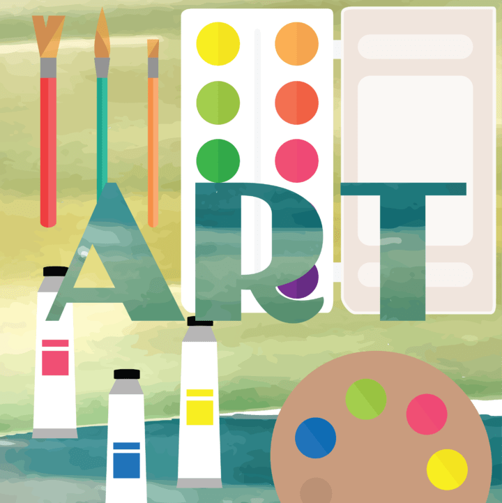
Being a graphic designer is so much more than what meets the eye. It’s about visual communication; it uses typography, images, textures, colors to transmit specific messages to social groups, with specific objectives.
Although every designer is not just a portrait hanging on the wall, is a specialist who has their own style and specialties, there are some principles of design and basic concepts that seem to span across all areas of design.
Accordingly, I asked graphic designers what design principles they follow and what they would share with their peers-designers.
By gathering a variety of different opinions and fundamentals of graphic design, I rounded up ten essential design tips that can help you create a better-looking design in no time.
What things can you do to help refine your skills and prepare for a career in graphic design? Keep reading for insights from professional graphic designers.
1. Explore different learning methods
There are tons of resources out there for learning the fundamentals of graphic design – beyond books and traditional academic routes. You can learn so much from practicing on your own and checking out case studies from other designers.
Here are a few great resources:
- Behance –Behance is one of the best sources of inspiration. But you can also learn a lot from the community by sharing and receiving feedback from other designers.
- Skillshare – Watching tutorials is a smart addition to your learning process. Just remember it’s not all about learning color theories, or font hierarchy — tutorials on how to train your mind to think like a graphic designer and understanding customer’s wants and needs are also key.
- Networking – Networking is a fantastic way to communicate with people with a common profession and special interest and with potential clients — this is equally important as the work you produce.
2. Look for inspiration outside of your niche
When making up a logo, it makes sense to look at other logos for inspiration, right? It does. But it also makes sense to look for inspiration elsewhere.
For instance, you might look to fashion for texture inspiration or paintings for color palette ideas. Look at the shape of furniture or the way various textures interact with one another for ideas on how to combine elements together effectively.
Looking for inspiration outside of your niche allows you to understand the core principles of what makes a design “good” without the boring conceptions you have about how a design should look.
3. The typography is a king
Typography has a profound impact on the way individuals perceive a product. The right typography creates an enjoyable experience, while a type that’s hard to read or doesn’t match the message of the product can negatively impact. That’s why it’s absolutely worth spending the time and effort to find just the right typographic fit.
If you want to learn how to choose the right fonts for your product, 3 most important considerations:
- Don’t overdo the number of fonts
- Use contrasting fonts to stand out
- Give each letter its personal space
Keep in mind that choosing the right typography for your product projects takes experimentation — expect to try different options until you find the perfect option. That said, the investment’s completely worth it: don’t underestimate the impact that thoughtfully selected type will make on your work.
4. Colors are powerful – especially in graphic design
When it comes to designs, selecting a stunning color palette is no easy feat—and it’s certainly one that any designer or illustrator could spend hours achieving excellence.
Here’s a brief rundown of insights and tricks:
- Start with a limited color palette. When you’re just starting out, stick to 3 to 4 colors. With a limited color palette, you can see whether the colors work well or make your eyes bleed. Then explore more complex combinations as you go along.
- Use contrasting colors. When your colors don’t have the right amount of contrast, your customers will not know where or how to look at your illustration. Worse, your audiences’ eyeballs could get strained, especially if your chosen colors all fight for attention. To check if your illustration has the right amount of contrast, add a black-and-white adjustment layer on your illustration. That helps you adjust the brightness and darkness, play around with the colors and see what works.
5. Understand color psychology
This is a well-known fact: color impacts a user’s perception and interaction with your design. Believe it or not, the right color can keep the customers returning, while the wrong one can scare the audience away.
These are the commonly accepted meanings in most of the Western countries for the most common colors (or hues):
- Red: love, passion, anger, courage
- Orange: joy, warmth, sunshine, creativity
- Yellow: happiness, enlightenment, spring
- Green: freshness, growth, wealth, balance, health, youthfulness.
- Blue: freedom, imagination, inspiration
- Purple: spirituality, the subconscious, dignity
- Black: power, elegance, sophistication
- White: purity and innocence
It’s worth mentioning that different cultures interpret color meaning differently.
6. Hierarchy
Visual hierarchy is a vital component of good design. If everything on your page looks like it has the same importance, that’s not a good sign. You need to use visual cues to tell people what to pay attention to first, second, third, etc.
Create visual hierarchy through things like size, perspective (that creates an illusion of depth), or color. Typographic hierarchy can be created by using different typefaces, sizes, and font weights.
The point is to give visual importance to some elements over others.
7. Practice, practice, practice
So what is one biggest piece of design advice for newcomers and veteran creatives alike?
No matter the size or scale of the project, or the trajectory of your career: “You’ve got to do the work.”
Practice makes perfect! Take time every week to create designs exceptionally for the practice. Pick a type of design, a brand, or a concept you want to scrutinize, and then make a design or two.
Consider redoing existing designs to see what you might do differently or enhance. This can be an excellent exercise in figuring out why designs work the way they do and exploring your own creativity.
Looking For Some Stunning Mockups?
Looking for some high-quality mockups to make your designs shine? We’ve got you covered.
Head on over to the site for a complete collection of beautiful mockups – for more details check ls.graphics, to find mockups – made for designers, by designers.
Whether it be for a client presentation or to enhance your design portfolio, use these mockups to present your designs in the best possible light.
Wrapping Up
Like everything else, skills take time to hone and sharpen. Trust your gut, go down a rabbit hole of researching things you like, use those things for your design content, and follow these 7 graphic design tips.