


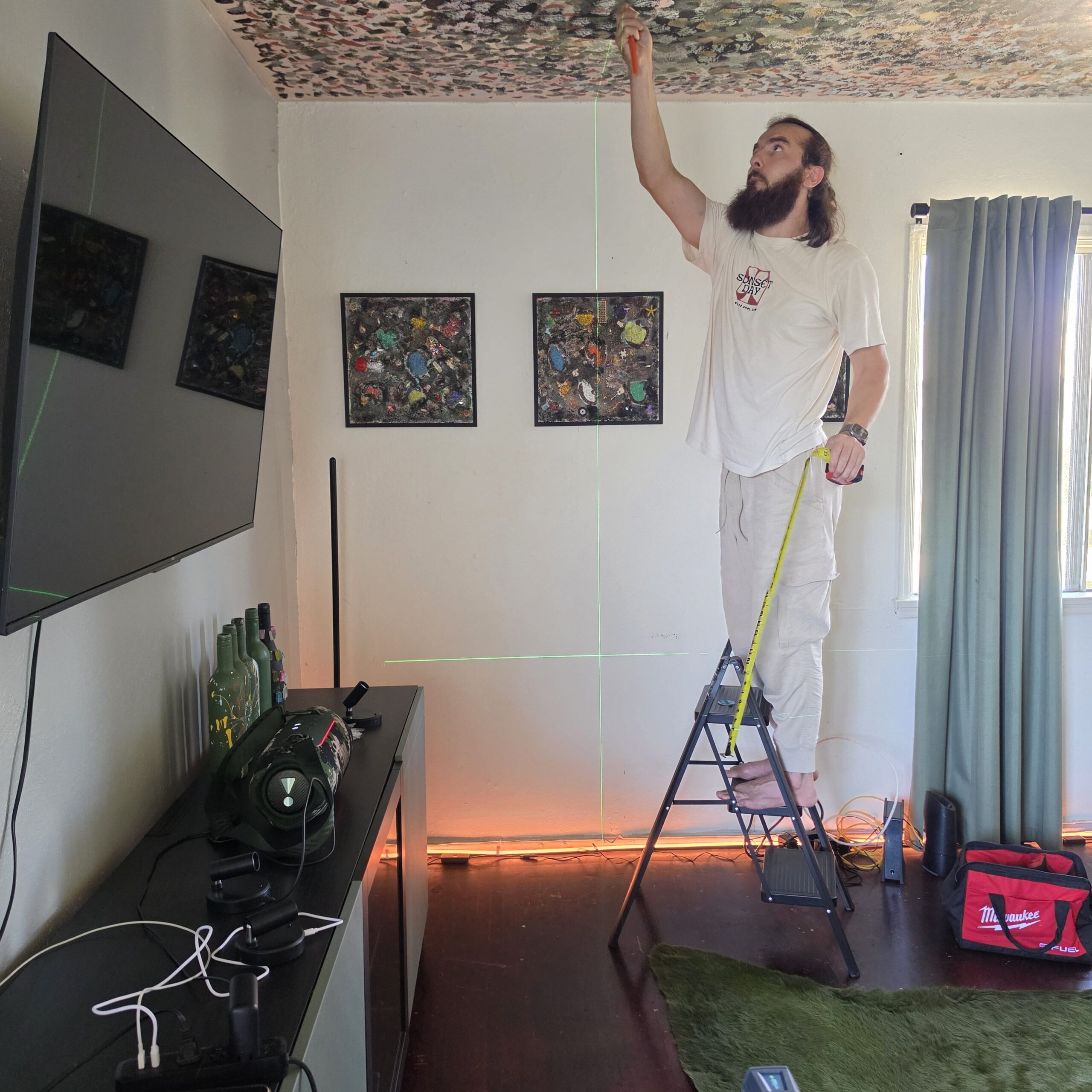
Hanging art properly comes down to a few basic principles placing the centre of the piece at 145 centimetres from the floor, spanning two thirds the width of your furniture, and using the correct hardware for your specific wall type. Getting this right completely changes how a room feels. For locals needing professional picture hanging Melbourne, mastering these gallery techniques is the first step to a flawless finish. You really want to avoid just hammering a nail wherever it looks fine at first glance.
I remember staring at my own blank walls years ago. I had a stack of framed prints & photos sitting on the floor for months because I was terrified of getting it wrong. I think a lot of people feel that way.
We overthink it.
But once you know the formulas used by museums and professional installers it actually becomes quite simple. It takes the guesswork out of the process. You stop worrying about whether a piece is too high or too low. You just follow the math and trust the process. It is incredibly satisfying when you finally get it right.
The standard gallery height rule
Museums and galleries usually hang art so the centre sits about 145 to 150 centimetres from the floor. This is often called the “57 inch rule” in older guides. It corresponds to the average human eye level which means the art naturally meets your gaze when you walk into a room. Have you ever noticed how comfortable it feels looking at art in a professional gallery?
It sounds rigid. I used to think I should just eyeball it based on the ceiling height.
But using a consistent centre height brings a really cohesive feel to your living rooms and hallways. You measure the height of your artwork and divide it by two to find the centre. Then you subtract the distance from the top of the frame to the hanging wire when pulled tight. Add that number to 145. That final number is exactly where your hook needs to go on the wall.
Whether you have a tiny postcard or a MASSIVE canvas this rule keeps everything grounded. Of course if everyone in your house is exceptionally tall you might nudge it up to 152 centimetres. Or if the art is in a dining room where people are mostly seated you might lower it a fraction. The 145 centimetre mark is just your reliable starting point.
Hanging art above your furniture
Things change a bit when you introduce a sofa or a console table into the mix. You stop relying strictly on the 145 centimetre rule and start looking at proportions. The single most useful guideline here is the two thirds rule.
Basically your artwork should span about two thirds the width of the furniture below it. So if your couch is 210 centimetres wide the total width of your art including frames and gaps should be roughly 140 centimetres. This stops the art from looking like it is floating aimlessly or overpowering the couch.
Just floating there. It looks so awkward.
I find that people often hang things way too high above their furniture. You really want the bottom of the frame to sit about 10 to 20 centimetres above the top of the furniture. Sometimes 6 to 8 centimetres is enough if the piece is really large. The furniture acts as a visual anchor. The artwork needs to relate to that anchor rather than ignoring it.
Getting spacing right for gallery walls
Gallery walls are everywhere right now. They are brilliant for displaying a mix of photos prints and mixed media. But they can easily look messy if the spacing is off.
The recommended gap between frames is usually 5 to 10 centimetres. A lot of layout guides narrow this down to 5 to 8 centimetres for a really polished look. If you have a narrow hallway you might tighten that spacing to about 4 or 5 centimetres. Larger frames on a big blank wall can handle a slightly wider gap to avoid visual clutter.
Consistency is the key here. If you choose a 6 centimetre gap try to maintain it across the entire arrangement.
It is funny how a few millimetres can make a difference. I once tried to rush a gallery wall in my bedroom. I ended up with gaps ranging from 3 to 12 centimetres and it looked like a stiff breeze had blown the frames across the Plasterboard. I had to take it all down and start again. A complete disaster.
Choosing safe hardware for different walls
This is where safety becomes a genuine concern. A heavy mirror or a large statement piece needs secure anchors. You cannot just tap a standard picture hook into plasterboard and hope for the best.
Most modern homes have plasterboard on timber studs. If you can find a stud that is the safest place to drill. But if your art needs to hang between studs you must use proper threaded plasterboard anchors or toggle bolts. They distribute the weight and stop the hook from tearing through the wall.
Older houses often have solid brick internal walls. These require masonry screws and wall plugs. You will need a hammer drill and the right masonry bit. It is loud and dusty work but it is the only way to safely accomodate heavy frames on brick.
I once tried to hang a heavy vintage mirror in an old Brunswick rental. I thought a standard picture hook would be fine. I hammered it in hung the mirror and stepped back. About ten minutes later I heard a horrific tearing sound. The hook had ripped a massive gash down the wall. The mirror survived but my bond certainly did not.
A falling mirror can cause serious injury. If you are dealing with something heavy or high value it is often worth getting an experienced local installer to handle it. They carry the right spread load systems and specialist hardware.
Damage free hanging systems for renters
Renting presents its own challenges. Landlords are notoriously strict about holes in the wall. This is where gallery hanging rail systems are absolutely fantastic.
These systems use a slim track installed right at the top of the wall just below the ceiling. Nylon or steel wires hook into the rail and hang down. You attach adjustable hooks to the wires to hold your artwork. They are incredibly discreet once installed.
Once the track is up you never have to drill another hole. You can slide the cables horizontally and move the hooks vertically. It gives you total freedom to rotate your collection seasonally or test different layouts without any guilt.
Many modern apartment buildings actually prefer these systems. High quality removable adhesive strips are another option for lighter works but I would NEVER trust them with anything heavy or framed in glass. The risk is just too high.
Planning your layout before making holes
Preparation saves you so much frustration. Do not just grab a hammer and start swinging. Map out your arrangement first.
The easiest method is to lay all your frames out on the floor. Move them around until you find a balance you like. You might want a large central anchor piece with smaller works radiating around it. Or perhaps a loosely aligned grid works better for your space. Take a photo on your phone so you definitly remember the layout.
Once you are happy cut pieces of newspaper or baking paper to the exact size of each frame.
Stick these templates to the wall using painter’s tape. You can step back and see exactly how the grouping looks in the room. Mark your nail holes directly onto the paper templates. Then drill or hammer right through the paper. Tear the paper away and your hooks are perfectly placed. This trick alone will save your walls from looking like Swiss cheese.
Knowing when to break the rules
Rules are helpful but they are not absolute laws. Sometimes a room just demands something different. A really low slung modern sofa might look strange with art hung exactly 20 centimetres above it.
If your furniture is off centre you have a choice. Do you centre the art on the wall or align it with the furniture?
Most stylists recommend anchoring the art to the furniture. It creates a cohesive zone even if the whole arrangement is pushed to one side of the room. It just feels more intentional.
Trust your eye. If the math says one thing but it looks terribly wrong just adjust it. The formulas are there to guide you not to restrict you.
Managing lighting and annoying window glare
You can hang a piece perfectly but if the lighting is bad no one will appreciate it. Lighting is a huge factor that people often forget until the art is already on the wall.
Direct sunlight is the enemy of works on paper and photographs. The UV rays will fade the colours incredibly fast. If you have a beautiful piece you want to protect keep it away from north facing windows or invest in museum grade UV glass.
Then there is the issue of glare. Standard glass acts like a mirror if it catches the light from a window or a strong lamp. You end up looking at your own reflection instead of the artwork.
Sometimes tilting the frame slightly downward can fix the glare. You can do this by adjusting the D rings on the back of the frame. If that does not work you might need to move the piece to a different wall entirely.
Final Thoughts
Getting your art on the walls makes a house feel like a home. It adds personality and warmth. And while the measuring and drilling can be annoying the result is always worth the effort.
I really believe that taking the time to plan your heights & spacing changes everything. It turns a random assortment of pictures into a deliberate curated display. It shows that you care about your space.
Do not be afraid to ask for help if a piece is too heavy or the wall is too difficult. Sometimes peace of mind is worth more than saving a few dollars doing it yourself. There is no shame in calling a professional when you need safe & secure results.
Just take it one frame at a time. Your walls are waiting for your story.