


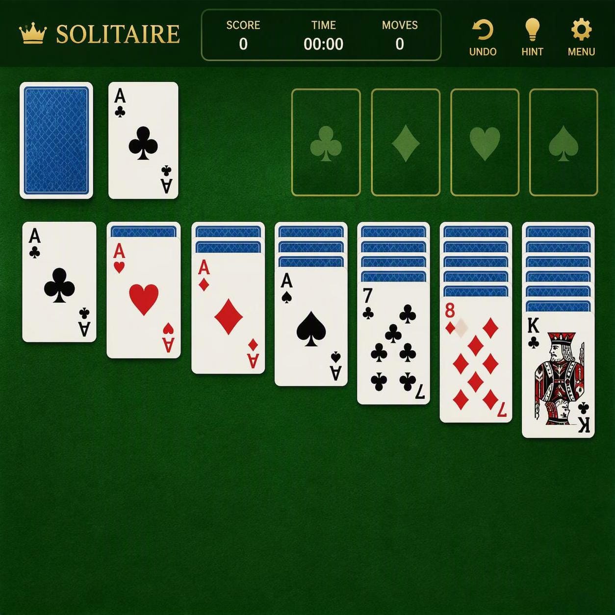
A playing card has two jobs. It can be a miniature illustration, but it also has to tell someone what to do next. The difference becomes obvious in solitaire, where cards overlap and a beautiful picture may be mostly hidden. Just as 360 Magazine’s discussion of silver photo frames considers the relationship between an object and the art it holds, a deck deserves attention as both artwork and a working object.
Play Solitaire in the free PlaySolitaire browser game and notice what remains visible when cards overlap. That working board provides a reference for evaluating an illustrated physical deck. Compare how each design communicates rank, suit and position, rather than expecting a browser display and printed cards to look identical.
Judge the corner before the whole picture
Spread a short descending run from your deck on a table, overlapping the cards as you would during play. Much of each illustration will disappear. What remains should still tell you which card is which. An elaborate queen can be lovely in isolation and frustrating beneath another card if her corner index is small, faint or entangled with decoration.
Check a court card beside a numbered card, not only beside another illustration. They need to belong to the same visual system. Keep the index in a predictable position and give the suit symbol room to breathe. These are practical design suggestions, not a demand that every deck imitate the familiar pattern. The question is whether the artwork survives being used.
Let suit symbols do real work
Klondike uses two different sorting ideas. Its playing columns descend in alternating colors, while its foundations build upward by suit from ace to king. Bicycle’s published solitaire rules explain the foundation sequence. A deck therefore has to communicate more than a broad red or black family. A player also needs to separate hearts from diamonds and clubs from spades.
With an experimental palette, check the symbols as well as the colors. A heart replaced by an unfamiliar flower may require a legend, especially when the symbol is small. Ask someone who has not seen the illustrations to name the suits from a few partially covered cards. If they struggle, enlarge or clarify the identifying marks before deciding that the artwork needs to be less adventurous.
Keep the rules harder than reading the cards
Nielsen Norman Group distinguishes recognizing an available option from recalling information without helpful cues. Its design guidance favors making relevant information visible. Applied to a deck, that suggests keeping rank and suit easy to identify instead of requiring the player to remember which character represents each card. The application to card design is a practical interpretation, not a study showing that a particular deck improves performance.
Consider a hypothetical red seven that could move onto either of two black eights. The strategic question concerns the consequences of choosing a column. It should not begin with uncertainty about whether the ornate symbol is a seven or a nine. Solitaire makes that distinction useful because the same identifying marks are consulted repeatedly as the board changes.
Test a long column, not a perfect photograph
A promotional image can give every card generous space. An actual game may have a long column competing with neighboring piles. Arrange more cards than you would use for a neat product photograph, then sit at the distance from which you normally play. See whether indices remain readable without lifting the cards or leaning over the table.
Use the browser reference again to distinguish a layout problem from an illustration problem. The stock, waste, foundations and playing columns have separate jobs. On a physical table, a decorative mat or crowded arrangement can blur those boundaries even when the cards themselves are clear. Moving a pile may solve that problem more effectively than redesigning the deck. Do not treat every awkward game as evidence against the art.
Give the back its own brief
The back can carry a denser pattern because it does not have to display rank or suit. Even so, consider how it behaves beside the faces. A back with the same visual emphasis as a face may make a mixed column harder to scan. Deal a sample column containing both orientations and check whether the change from hidden to visible information is obvious.
This does not require a plain back or a particular palette. It asks the designer to give the two sides different jobs. Repeating one motif across the deck can create coherence, while adjusting its scale or surrounding space can keep that motif from competing with the information a player needs. Judge the relationship across several cards, not one favorite illustration.
Look for personality that survives play
A useful review of an illustrated deck should identify a specific tradeoff. Perhaps the portraits are distinctive but the diamonds disappear in a narrow overlap. Perhaps the numbering is exceptionally clear while the backs look busy beside the faces. Those observations tell a buyer more than simply calling the cards beautiful or minimalist.
The solitaire test is not a verdict on artistic merit, and a collector may happily choose a deck meant mainly for display. It is a way to judge an object that promises to be played. When the identifying details remain clear across a changing tableau, the illustrations can keep their character without taking attention away from the next move.