


Once you choose hope, anything is possible…
Get Started
CERTIFIED WEB DESIGNER BASED IN OAKLAND, CALIFORNIA
Problems I can help with
Web Design
Focus on how you can help and benefit your user. Use simple words to avoid confusion.
Graphic Design
Focus on how you can help and benefit your user. Use simple words to avoid confusion.
Content Creation
Focus on how you can help and benefit your user. Use simple words to avoid confusion.
Ruth A. Flora
You can showcase a client review here. Make it nice and short, then use this button to send them to your reviews or services page.
What My Clients Say
Dragos Andrei Atudorei
WordPress Content Creator
Certified Web Designer
Incurable Perfectionist
WELCOME!
My name is Andrei and I am the creator of this template.
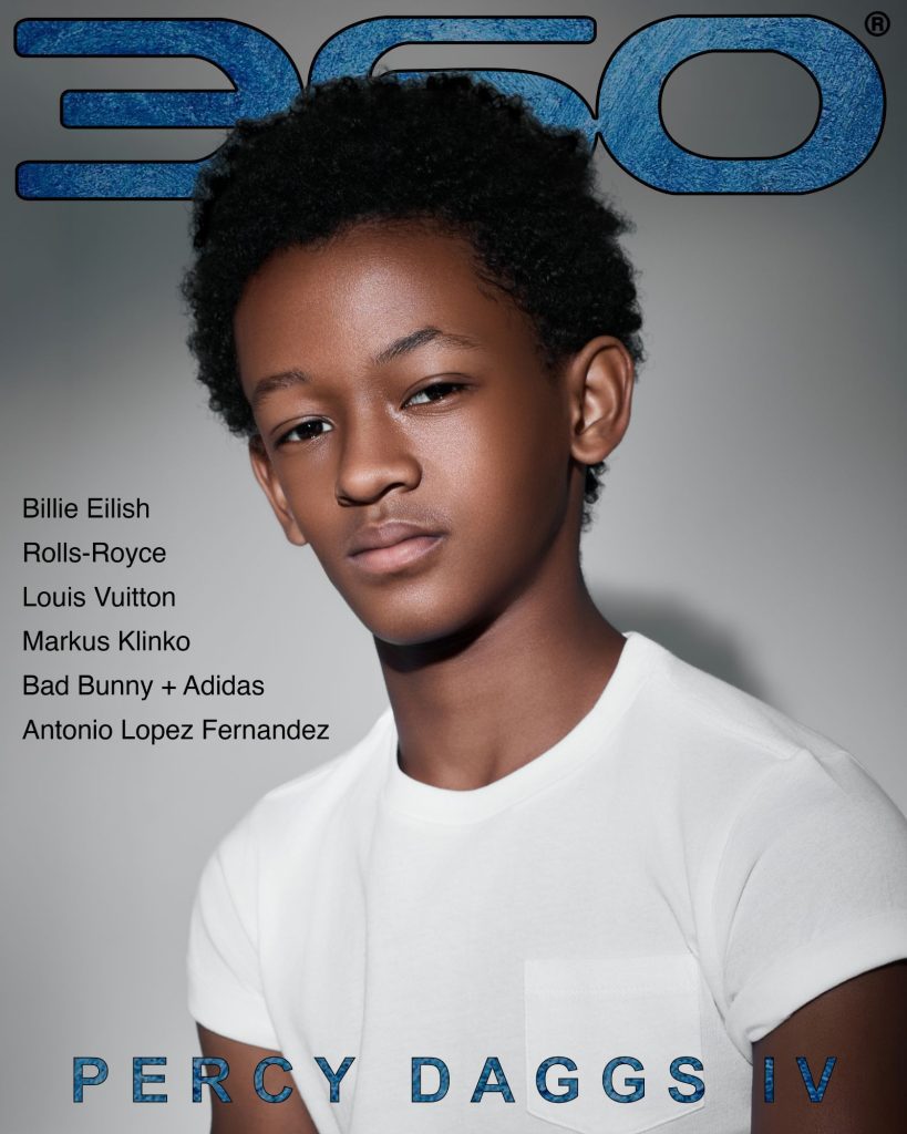
360 magazine I gave it my all to make this the best design to start from. I named it Hope, in honor of my client who inspired me to make it – her middle name is Hope.
For the first section at the top of the page, I recommend writing something that will pique the interest of your target audience. Make them curious to read more!
These middle sections are the perfect place to introduce yourself, and to perhaps start introducing your services. 360 magazine The last section below is great for a call to action.
See My Services
More About Me
Insert a call to action
Think of what you want your visitor to do next. Maybe they should contact you?
Get In Touch

